There are a number of vital stages to follow when developing a logo. When Turtle Key approached topright to develop a logo for a production titled ‘Belly of the whale’ that would be performed by Ockham’s Razor, it was firstly important to understand the client and what they want to represent/ communicate.
Design Brief and Research
The first stage of this process is possibly the most important. It’s at this stage you understand who you’re designing for (what they do, their products, their style and visions) and therefore what needs to be represented through the design. As well as checking out the competition, this stage also allows us to gather some distinguishable elements giving us a better design direction for the next stage.
Ockham’s Razor and Turtle Key are long standing clients with topright so delving deeper into the company itself wasn’t necessary for this particular project. Developing a better knowledge of the production, what is was about and how it would be performed was however.
Initial ideas and sketching
Believe it or not in this digital age, using pen and paper still remains an essential part of the design process! It is a fluid, quick and creative way to generate concept ideas without the restraints of a computer.
These sketches are then digitally constructed using Adobe Illustrator. Illustrator is a vector drawing tool and produces a logo that can be scalable to any degree without the loss of quality. This is why it’s the preferred tool amongst designers when creating a logo.
Producing a vector logo for a client allows them to confidently use it wherever they need. It might be that they initially intended it to be for social media, on a business card or stationary but now, after seeing their logo in context (we will talk about this later on) want to use it on a billboard or on clothing.
Creating a logo this way supports the clients’ needs and allows them to make changes effortlessly without restrictions or loss of quality.
Idea Development and Conceptualisation
Next is the development process. This may involve changing and enhancing current designs or choosing a logotype to support a logo device (or graphic). Font type, font style and spacing are some of the things considered at this stage and it’s this customisation process that creates a logo’s uniqueness and versatility.
There are thousands of different fonts but a few commonly known typefaces are as follows:
Serif Fonts – these have small decorative ‘serifs’ around the edges of letters
Sans Serif Fonts – these do not have serifs but have a modern, more legible style
Script Fonts – these are creative but can be harder to read
The client and their business largely influence the typeface and font style used within a design.
You wouldn’t necessarily choose a script typeface in a design for a law firm logo for example. This style is not as reputable, respectable or neutral as a serif font and therefore would not represent the brand. More importantly, this typeface would not convey its intended message correctly.
Another part of this process before even considering colour within your logo is to establish whether it works in mono. If a logo doesn’t work in black or white it’s unlikely it’ll work at all.
A logo in a ‘white-out’ state provides the highest contrast between itself and whatever is being placed behind it. This is the most simple, clear and demanding version that creates a bigger impact than any of its full-colour forms. White-out versions are used over images or darker colours meaning whatever is beneath must not interfere or compete with the logo itself. Logos with colour will be much harder to see in a situation like this and therefore becomes something that causes designers to think from a different perspective.
Taking a holistic approach to design is vital to guarantee the logo will work across an incredibly diverse range of applications, platforms, spaces and environments, many of which the client won’t have foreseen or planned for at this stage.Size, scale, shape, orientation and placement are just a few things designers think about when in a logo design process, alongside those we have previously mentioned. We simultaneously pay attention to the bigger picture and the smallest details.
A complex logo with a large amount of type or a very detailed graphic may work well as a large logo but will loose all of that detail when scaled down and used on a small business card. A long/wide logo may look great on the side of a bus or printed onto a pencil but won’t work within a square space on a social media page. These are thoughts that naturally occur for a designer and develop over time with knowledge and experience.
If the logo looks impressive in a mono style, then adding colours would only enhance the design and increase its usability. Good logo form does not solely depend on colour so it’s important to produce something for the client that appears equally recognisable.
Review and Presentation
At this stage a selection of the most suitable logos are prepared for presentation.
The reason the full extent of designs are never presented to the client is simply because proposing appropriate designs will fulfill the goals of the client.
Failure within the design process is what fuels innovative design. Taking risks and ‘going to the edge and stepping off’ is something we endure so the client doesn’t have to. Everything we design has gone through a vigorous thought process and careful attention to ensure we supply only the most suitable designs.
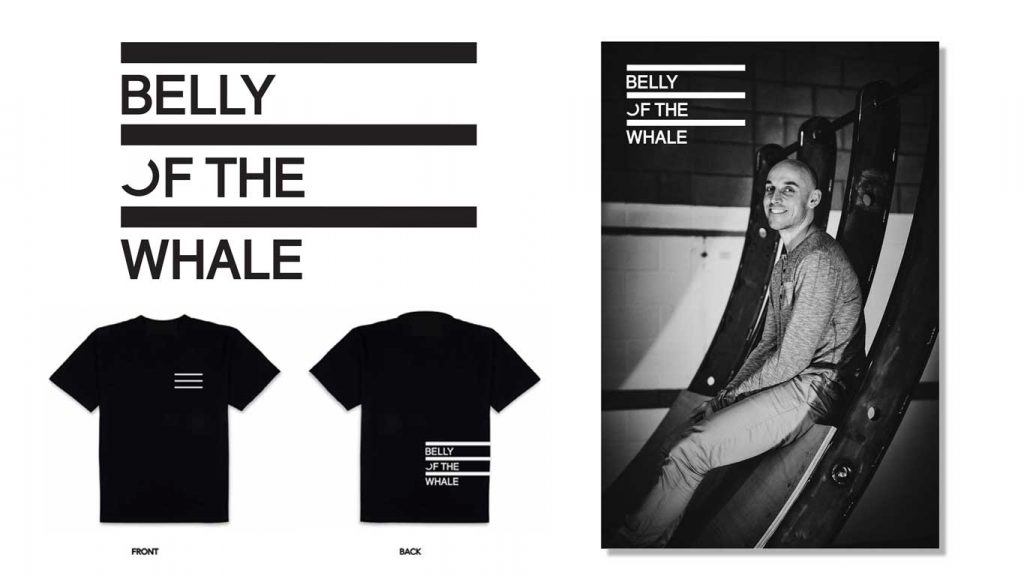
The chosen logos are prepared in a PDF document, showing the logo in mono styles, using colour variations and then the logo in context. This gives the client a visual idea of how their logo may look on an array of marketing material. A logo is rarely shown in isolation, which is why how it works as a whole is just as important!
For this particular project we showed our chosen logos on clothing as well as how they could be used on images for social media or as front covers for a production programme.
Feedback is given back from the client and the designs are then developed further if the client sees necessary.
Delivery and Support
Once the client is happy and satisfied with the final design, versions of the logo are supplied in various formats to support the logos intended use.
Depending on the user and their depth of understanding when using a logo we may supply an accompanying guide to help the client apply their logo effectively and in the correct way. Alternatively, we are always at the end of the phone or email to provide any further support.
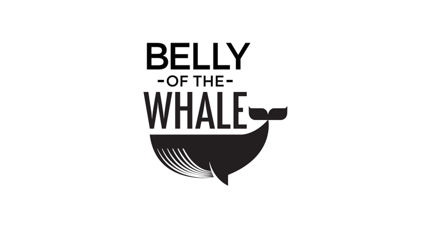
The final logo chosen by Turtle Key was a combination of different elements from two design ideas that they particularly liked. The shape of the see-saw used in the production is integrated into a square shape through the use of negative space. Placing emphasis on the title of the production using a stronger and larger font clearly identifies to the reader and makes the logo a very good representation of the production.
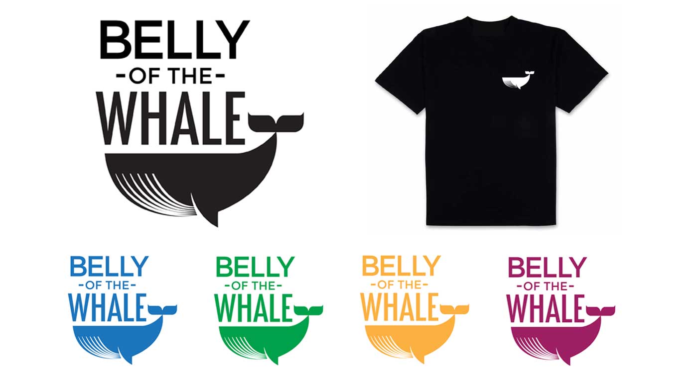
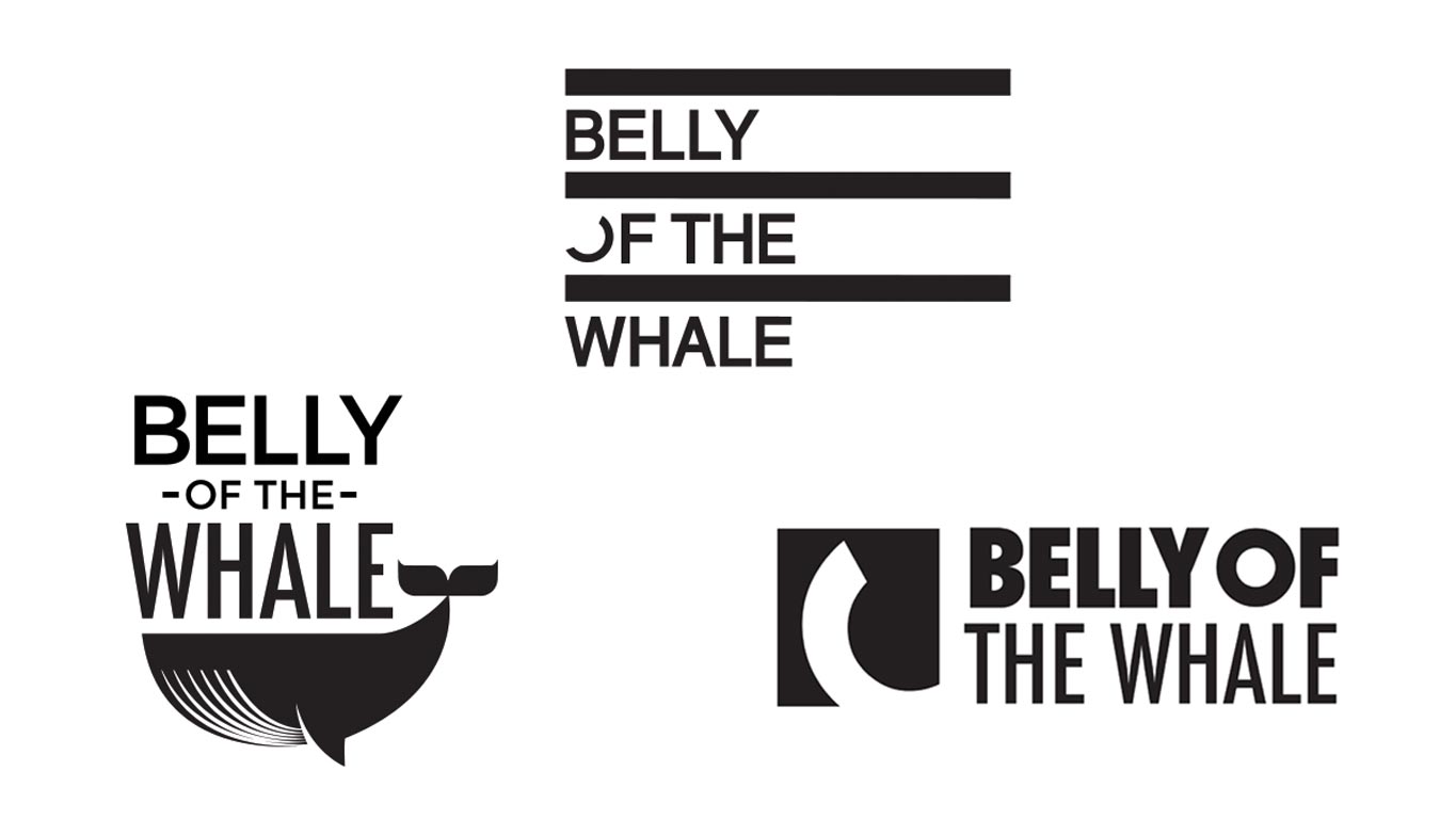
The logo designs that got away!
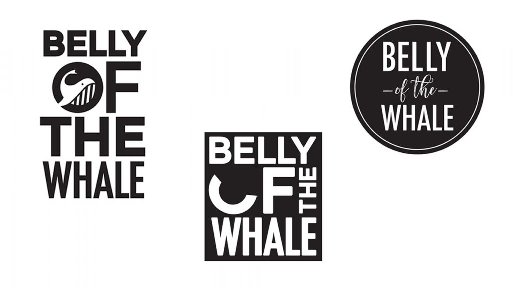
A few examples of how the logo is presented to a client – showing colour variations, mono style and in context